
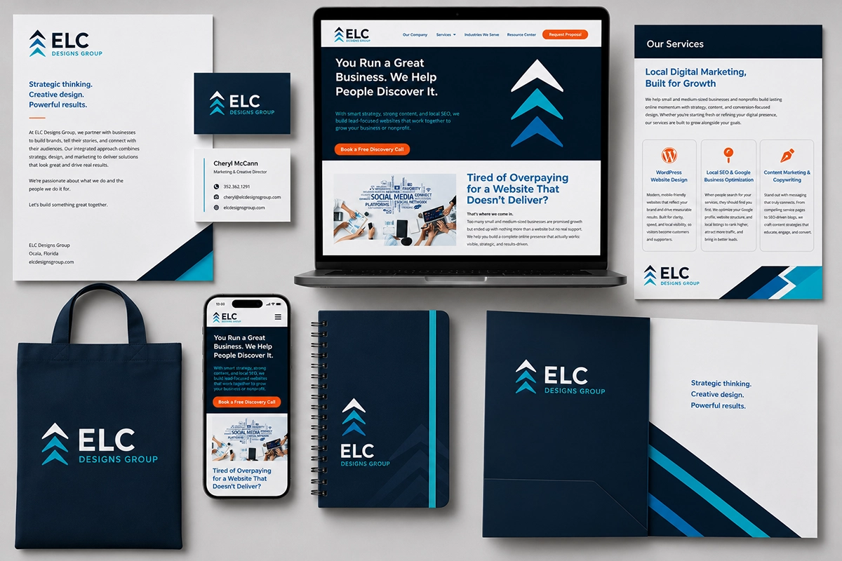
Your visual identity is often the first interaction potential customers have with your business.
Before anyone reads your website, speaks with your team, or learns about your products and services, they usually see your company logo and brand colors. Those visual elements immediately begin shaping how they feel about your company.
A strong visual identity can make your business appear professional, trustworthy, established, and memorable. An inconsistent or poorly designed identity can create confusion and make even a great company seem less credible.
That is why thoughtful logo design, an appropriate color palette, and carefully selected fonts can make all the difference.
What Is a Visual Identity?
A visual identity is the collection of design elements that visually represent your brand.
It typically includes:
- Your logo
- Brand colors
- Fonts and typography
- Graphic styles
- Photography
- Icons
- Shapes and patterns
- Layout and spacing
Together, these elements create a visual representation of your company’s personality, values, and overall brand vibe.
Your visual identity is part of your larger brand identity. While your brand also includes your messaging, reputation, customer experience, and brand values, your visual identity is what people see.
When everything is perfectly aligned, customers are more likely to recognize your business, remember it, and understand what it stands for.
Why a Strong Visual Identity Matters
Many business owners treat branding as decoration. In reality, it plays a much more strategic role.
Strong visual branding helps your company:
- Create a lasting impression
- Appear professional and credible
- Become easily recognizable
- Stand out from competitors
- Communicate your brand’s personality
- Build trust with potential customers
- Maintain consistency across platforms
- Strengthen customer recognition
A memorable logo, consistent color palette, and clear typography make it easier for customers to identify your business quickly.
Think about well-known brands such as Coca-Cola, Apple, or FedEx. Their visual identities are so consistent that most people can recognize them from a color, font, or partial logo alone.
That level of recognition does not happen by accident. It comes from clear design principles and years of consistent use.
Logo Design Tips: What Makes a Good Logo?
A good logo should communicate something meaningful about your business without trying to explain everything at once.
Some of the golden rules of good logo design include keeping it simple, memorable, relevant, versatile, and easy to recognize.
Keep It Simple
A simple logo is usually more effective than one filled with unnecessary detail.
Simple logos are easier to:
- Recognize quickly
- Reproduce at different sizes
- Use across marketing materials
- Print clearly
- Remember later
A logo may appear on everything from a large sign to a tiny social media profile image. If it becomes unreadable when reduced in size, it is not versatile enough.
A great logo communicates its idea quickly, without requiring the viewer to study every detail.
Make It Memorable
A memorable logo usually contains one clear visual idea.
The Apple logo is a great example. It uses a simple shape that is immediately recognizable. The FedEx logo is another well-known example because it includes a clever use of negative space between the letters E and X.
You do not need to copy famous brands or rely on complicated tricks. The goal is to create a strong logo that customers can easily connect with your company name.
Make It Relevant to Your Brand
Your logo should also reflect your industry, your target audience, your brand values, and your company personality.
A law firm may want a polished and traditional design using serif fonts and structured shapes. A children’s business may benefit from brighter colors, organic shapes, and a more playful style.
Remember, the right logo should feel appropriate for the people you want to reach.
Make It Versatile
A professional logo should work in many different situations.
It should look good:
- In full color
- In black and white
- On a light background
- On a dark background
- On a website
- On business cards
- On signs
- On clothing
- On social media platforms
- On printed marketing materials
Most designers create several logo variations, including horizontal, stacked, simplified, and icon-only versions. These options help preserve visual harmony across different applications.
Common Logo Design Mistakes
Creating a logo may look simple, but the design process involves more strategy than many business owners expect.
Some of the most common mistakes include:
Making the Logo Too Complicated
A logo with too many symbols, fonts, colors, and decorative details can become difficult to understand.
Blank space, also called white space or negative space, gives logo elements room to breathe. Empty space is not wasted space. It improves readability and helps the most important parts of the design stand out.
Using Clip Art or Generic Symbols
Clip art and common template graphics may be easy to access, but they rarely create a unique business logo.
When many brands use the same symbols, it becomes difficult for any one company to stand out.
A professional logo should feel connected to your business rather than looking like a generic icon placed beside your company name.
Following Logo Design Trends Too Closely
Logo design trends can provide inspiration, but trends should not replace strategy.
A logo that feels modern today may look outdated in only a few years if it relies too heavily on fashionable effects or popular design styles.
Minimalist logos and simple geometric marks remain popular because they are versatile, but simplicity should still reflect your unique brand rather than copying what everyone else is doing.
Choosing the Wrong Fonts
A beautiful logo can become ineffective if the company name is difficult to read.
Decorative or display fonts may work well in small amounts, but they can create problems when letters become unclear.
Customers should be able to read your logo quickly, even when it appears at a small size.
Using Too Many Colors
Too many colors can make a logo feel chaotic and difficult to reproduce.
Most businesses benefit from a focused color palette of two to four colors, including primary, secondary, and accent colors.
Using the same color combinations consistently also strengthens brand recognition.
Understanding the Logo Design Process
A professional logo design process begins long before a graphic designer opens Adobe Illustrator or another design software program.
1. Explain Your Business
Be sure to inform your logo designer of the following information:
- What is your company’s history
- What are your products or services
- Who is your target audience
- Who are your competitors
- What are your brand values
- What is your market position
- What are your long-term goals
Without this information, a logo may look attractive but fail to represent your business accurately.
2. Clarify the Brand Personality
Before creating initial ideas, the designer will also need a clear idea of your brand’s personality.
Is your company:
- Traditional or modern?
- Formal or approachable?
- Bold or understated?
- Luxurious or practical?
- Playful or serious?
These decisions guide the selection of colors, fonts, shapes, and other design elements.
3. Develop Initial Ideas
The next stage often includes sketching concepts and exploring different styles.
These may include:
- Wordmark logos
- Lettermark or monogram logos
- Symbol-based logos
- Combination marks
- Minimalist logos
- Emblems
Creating a logo is not simply about making something attractive. Each concept should have a reason behind it.
4. Refine the Strongest Concepts
Once the initial ideas have been reviewed, the strongest options are refined.
This may involve adjusting:
- Proportions
- Letter spacing
- Alignment
- Icon placement
- Color combinations
- Font pairings
- Positive and negative space
Even small changes can dramatically improve how the logo appears.
5. Test the Logo
The logo should be tested in real-life applications before it is finalized.
For example, how does it look on:
- A mobile screen
- A website header
- A social media profile
- A business card
- A vehicle
- A storefront sign
- A promotional product
Focus groups, trusted business partners, or selected customers may also provide honest feedback and valuable insights.
The goal is not to ask everyone whether they personally like the logo. The better question is whether the logo accurately represents the brand and appeals to the intended target audience.
Choosing the Right Brand Colors
Color plays a powerful role in how consumers perceive a brand.
Although color meanings can vary by culture, industry, and context, certain associations are common.
For example:
Blue often communicates trust, dependability, and professionalism.
Red may suggest excitement, strength, energy, or urgency.
Green is frequently associated with growth, health, nature, or sustainability.
Yellow can feel optimistic, friendly, and energetic.
Purple may communicate creativity, luxury, or imagination.
Black often appears sophisticated, modern, or authoritative.
Orange can feel warm, enthusiastic, and approachable.
These associations are helpful, but there is no single perfect color for every industry.
The best color palette reflects your brand’s personality and appeals to your target audience.
How to Build a Cohesive Color Palette
Most brands need more than one color, but every color should have a specific purpose.
A typical palette may include:
- One primary brand color
- One secondary color
- One or two accent colors
- Neutral colors such as white, black, gray, or cream
A color wheel helps designers find combinations that create contrast and visual harmony.
The goal is not to use every color equally. Your primary color should lead, while secondary and accent colors support the overall design.
Appropriate colors should also work well in both digital and printed applications.
Before finalizing a palette, consider:
- How the colors appear on screens
- Whether they remain readable when printed
- How they look on light and dark backgrounds
- Whether they provide enough contrast
- How they compare with competitors’ colors
Consistent color use helps customers connect those colors with your business over time.
Why Fonts Matter in Branding
Fonts communicate emotion and personality, even when people are not consciously thinking about typography.
Different styles create different impressions.
Serif Fonts
Serif fonts include small decorative strokes at the ends of letters.
They often feel:
- Traditional
- Established
- Elegant
- Reliable
- Editorial
They are frequently used by law firms, financial institutions, luxury brands, and companies that want to emphasize heritage or authority.
Sans Serif Fonts
Sans serif fonts do not include the decorative strokes found on serif fonts.
They often feel:
- Modern
- Clean
- Friendly
- Simple
- Accessible
They are popular for technology companies, healthcare organizations, service businesses, and modern consumer brands.
Script and Display Fonts
Script and display fonts can add personality and style, but they should be used carefully.
They may work well for:
- Headlines
- Logos
- Accent text
- Special marketing materials
However, these fonts are often harder to read in long paragraphs or small sizes.
The best font selection balances personality with readability.
How Many Fonts Should a Brand Use?
Most brands need only two or three font styles.
A common system includes:
- A primary heading font
- A body font
- An optional accent font
Using too many typefaces can make branding materials feel disconnected.
Fonts should complement one another without appearing too similar. For example, a bold serif heading font may pair well with a clean sans serif body font.
The chosen fonts should be used consistently across the website, social media, advertisements, presentations, business cards, and other marketing materials.
Creating a Cohesive Brand Identity
A strong visual identity depends on consistency.
Your logo, colors, and fonts should work together as part of one system rather than appearing as separate design choices.
That system should be carried across:
- Your website
- Social media platforms
- Email marketing
- Digital advertisements
- Printed materials
- Business cards
- Signage
- Packaging
- Presentations
- Sales materials
- When different elements are used inconsistently, the brand becomes harder to recognize.
Consistent branding creates a polished, professional experience and helps customers feel confident that they are interacting with the same business everywhere.
Should You Design Your Own Logo?
Business owners now have access to countless logo generators, templates, and affordable design software options.
Creating your own logo may be reasonable when:
- You are testing a new business idea.
- Your budget is extremely limited.
- You need a temporary logo.
- You have strong design skills.
- The business is still in its earliest stages.
- However, DIY design also has limitations.
Without experience in graphic design, typography, color theory, and production requirements, it is easy to create a logo that looks good on a computer screen but does not function well in real-world applications.
Hiring a professional designer can help ensure your new logo is:
- Original
- Scalable
- Easy to read
- Strategically designed
- Appropriate for your audience
- Suitable for both print and digital use
A logo designer also provides the correct file formats and often creates brand guidelines explaining how the logo, colors, and fonts should be used.
Professional design does not simply make your company look better. It helps create a more valuable and consistent brand.
Your Visuals Speak Before You Do
Your logo, colors, and fonts communicate something about your company before a customer reads a single word.
They may communicate professionalism, creativity, reliability, warmth, luxury, affordability, or innovation.
The question is whether they are communicating the right message.
A strong logo, thoughtful color palette, and carefully selected fonts create a visual identity that helps customers recognize your business and feel confident choosing it.
Your visual identity does not need to be complicated. It simply needs to be clear, consistent, memorable, and true to your brand.
Build a Visual Identity That Represents Your Business
At ELC Designs Group, we help businesses create professional visual identities that reflect who they are and connect with the customers they want to reach.
Whether you need an entirely new logo, an updated color palette, improved font selections, or a complete brand identity system, we can guide you through the design process and create branding materials that work together across every platform.
Your visuals speak before you do. Make sure they say the right thing.
Book a Free Discovery Call to learn more